Overall Score Summary
Follow the steps mentioned below to view the Overall Score Summary page:
-
Select Classes on the top navigation menu and select a class.
-
Select Data on the left navigation pane, and Results by Assessment appears by default. The Diagnostic growth report section displays the report title and program name for the list of available growth reports at the top of the page.
-
Select the required growth report and the Overall Score Summary page are displayed by default.

-
View the Class average overall score on the top of the summary.
-
Select one of the available reports - Beginning of Year, Middle of Year, and End of Year from the drop-down list on the top right.
By default, the most recent administration appears.
-
Select any of the color-coded performance levels on the left to view the number of students that scored in that range. The performance levels are Exceeds expectations (purple color), Meets expectations (green color), Approaching expectations (yellow color), and Does Not Meet expectations (red color).
-
Select the blue colored View Report links on the right to display the latest student report for the selected student.
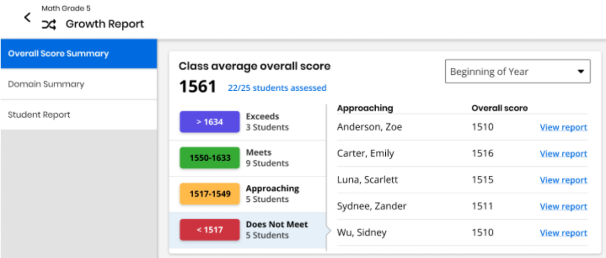
The performance levels used in Growth reports correspond to the grade level of the program. In the above image, Math Grade 5 performance levels are used.
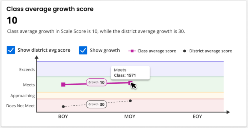
Class average growth score shows the class average growth over time at the top and on the line graph depicted in a maroon oval-shaped bubble. For example, in the image below, the class grew by 10 scale score points, from a class average of 1561 on the BOY Diagnostic to a class average scale score of 1571 on the MOY Diagnostic.
When district average scores are available, the intelligent text at the top of the section displays a district average growth, and a checkbox appears above the line graph to Show district avg score. If checked, district average performance and growth appears in black color on the line graph.
For example, in the image below, the district had an average BOY score in the red color Does Not Meet performance level range, grew by 30 scale score points, and ended just under the yellow color Approaching performance level range by MOY. We can compare this to the class performance and growth to get a sense for how the class is performing and growing with respect to their district peers.
By default, the blue colored Show growth checkbox is checked, displaying growth bubbles.
You can uncheck the Show growth checkbox to hide the growth values.
Quantile Measures
If available, Quantile measures place students and math skills on the same scale, indicating a student’s mathematical readiness and the difficulty of specific skills or concepts. Momentum reports Quantile measures in both Diagnostic and Growth Reports. Educators can use the skills database on the Quantile Hub (by MetaMetrics®) to look up measures aligned to any state standard. Comparing a student’s Quantile measure to a skill’s Quantile measure supports data-informed instruction. Close matches suggest appropriate next steps, while larger gaps point to needed scaffolds or enrichment.
To access Quantile measurements, select the Quantile measure tab at the top of the page. You can see an example of the Quantile measure tab below:
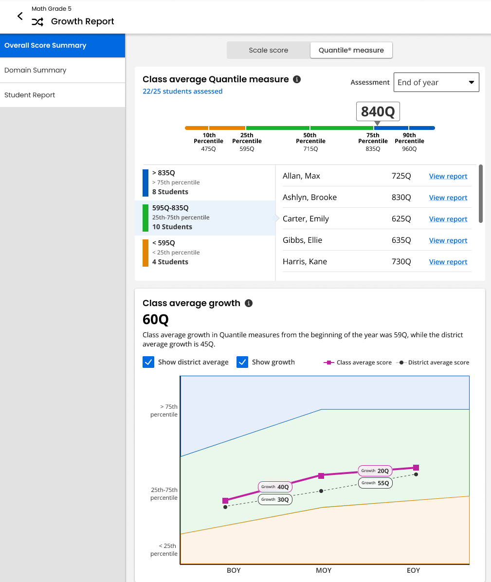
There are two panels worth noting here: Class Average Quantile Measure and Class Average Growth. The Class Average Quantile Measure depicts the class average Quantile measure, with detailed sorting of your students in percentiles based off of their Quantile measure. A Quantile measure is represented by a number followed by a Q, such as 840Q. Additionally, measures lower than 0Q are preceded by EM, or Emerging Mathematician, such as EM300Q. Class Average Growth depicts the difference in class average Quantile measures from one administration to the next.
For more information about Quantile measurements, see the Lexile® and Quantile Hub webpage.
See Also